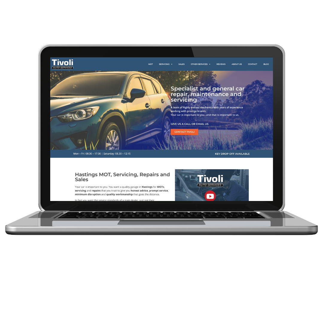
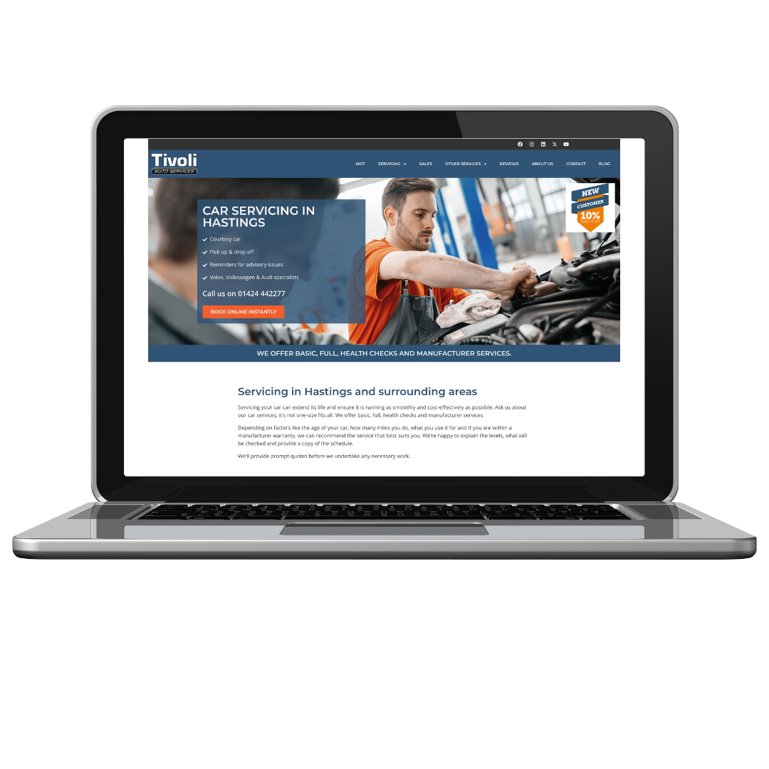
There were four elements of the existing site that we agreed to keep:
- The individual service pages that gave customers all of the information they needed and had clear call to actions
- The navigation was clear and purposeful, enabling users to quickly find the information they were looking for
- The images were relevant, on-brand and modern
- The copy was consistent in tone and well-written.
The areas that required the focus of the website redesign project mostly related to the backend (or under the bonnet!) of the website.
The site was originally built using a popular theme of the day and with any tools they come and go and, just as with a car, eventually you need to replace rather than maintain and repair.
There were more modern and faster-running themes and designs the site could have been using, and the existing ones were now out-of-date which would be affecting the performance of the site, its security and speed. Simply updating components around the old theme risked an error that could cause the site to not work. Users’ expectations also change, and the old styling did not match current expectations so could be putting prospective customers off.
Modern page builders need fewer additional plugins for functionality; meaning the website now uses fewer moving parts and has a reduced risk of security issues or performance conflicts.
Once that review was complete, we started by rebuilding the site on a modern version of WordPress, using a modern theme and page builder. In doing so, we’d rebuild each page -top to bottom- using the images available in the media library and the existing copy.
While working through the page with the modern page builder, the design could only look sharper, more crisp and modern. However, while maintaining the use of available elements, we had the freedom to use our intuition with the architecture of the page and the information.
- Simple text bullet lists became interesting icon lists, displaying horizontally.
- Stagnant service category columns now pop with hover animation as the user explores the page
- Hero sections with a plain image and paragraph text now have a clearer Call To Action with essential information displayed in a heading structure that promotes visual hierarchy (that was a long one).
- Check out the About page ‘before and after’ to see how the website begins to build rapport with potential customers.
Most notably, with an updated system from the website redesign, we were able to fully update the server around it (such as the PHP version) and give the site a security and performance boost.